Black Friday Landing Page: Examples and Best Practices
Create a high-converting Black Friday landing page that showcases exclusive deals, highlights products, builds shopper trust, simplifies checkout, and turns seasonal traffic into more ecommerce sales.
As Black Friday is weeks away, you need to create a dedicated page for your ecommerce store that helps shoppers understand your sale and find the right products. It should explain the offer, show what qualifies, answer buying questions, and provide a clear path to purchase or early-access signup.
You can have a strong offer and still lose the sale after the click. A shopper opens your promotion, lands on a crowded page, and starts looking for the product they just saw. Every unclear price or missing delivery detail gives them another reason to leave.
Adobe forecasts $12.9 billion in US online spending on Black Friday 2026, within a $275.1 billion November–December season. Those are forecasts. For your store, the useful question is how well your Black Friday ecommerce landing page turns incoming interest into worthwhile orders.
Start with the layouts below, then work through the offer, product selection, and purchase journey. If your page needs design or development work, Ecomgiantz’s ecommerce web design and development services can help put those improvements into practice before you scale campaign traffic.
Black Friday Landing Page Examples and Templates
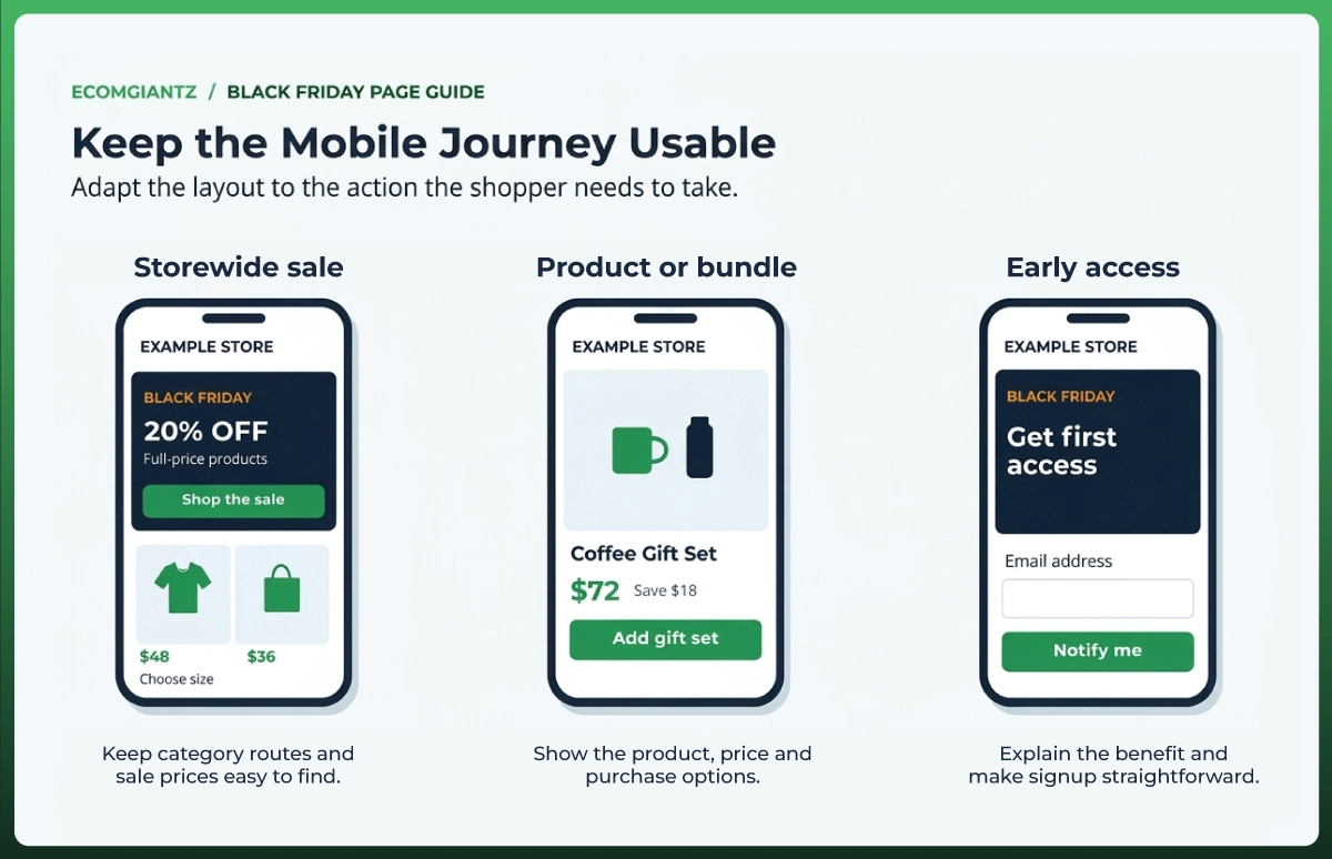
Black Friday landing pages need different layouts depending on what you sell and where visitors came from. The most useful Black Friday landing page ideas solve a specific problem, such as finding a category, understanding a bundle, or getting notified before launch.
A Storewide Sale Landing Page
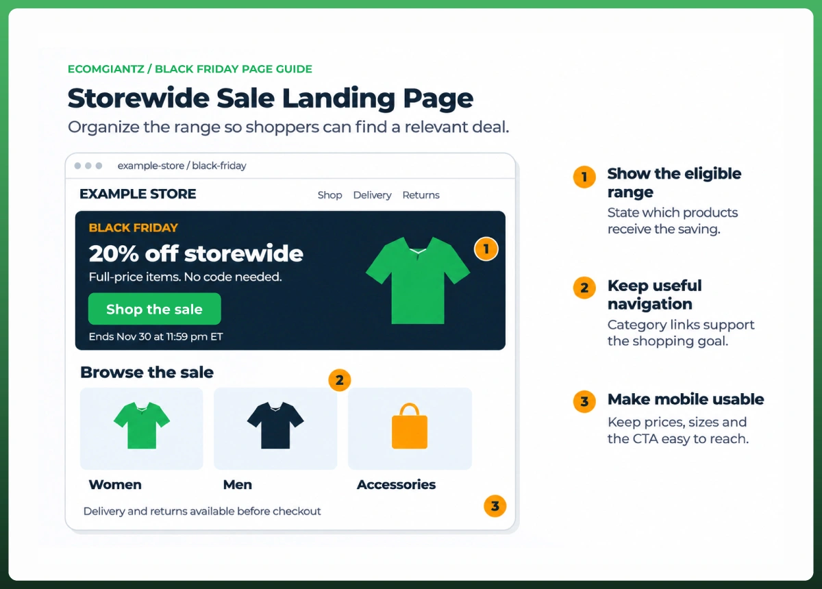
A Black Friday sale landing page suits a promotion covering several categories. Lead with the offer, then give shoppers useful routes into the range. An apparel store might organize deals by women, men, and accessories, with selected bestsellers beneath them.
Keep navigation that helps people shop. Category links and filters can serve the same buying goal as your main CTA. A large catalog needs more guidance than a single-product campaign, so removing every link can make the page harder to use.
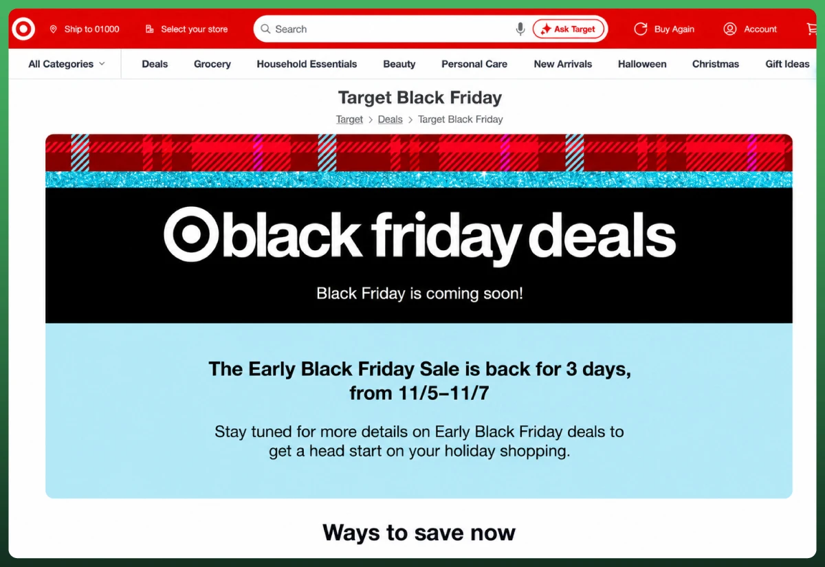
Target’s Black Friday page showed an upcoming early sale and current shopping options when captured on October 30, 2026. The useful lesson is the separation between an event that has not started and deals visitors can browse now.
A Black Friday Product Landing Page
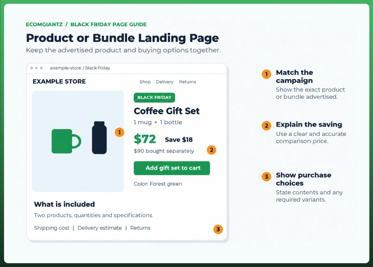
Use a Black Friday product landing page when the campaign promotes one item or bundle. Keep that exact product prominent. A visitor clicking an ad for a coffee gift set should arrive at the set, its contents, its price, and its purchase options.
For bundles, state whether the saving compares with buying the included items separately. Show quantities and explain any choices. If the customer must select a size or color, make that step clear before the page offers to add the item to their cart.
An Early-Access Landing Page
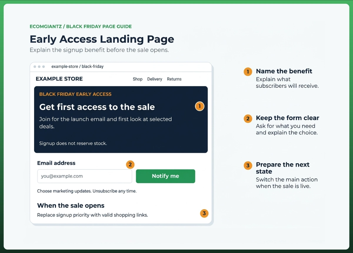
Before the sale opens, give visitors a useful next step. Explain what signing up provides, when they can expect an update, and whether access guarantees stock. Keep the form short and make the subscription choice clear beside the signup button.
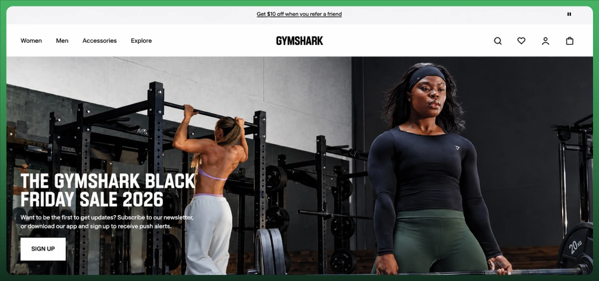
Gymshark’s page used its 2026 sale heading and a signup CTA when captured on October 30. This is a prelaunch example. Adapt the clear next action, then replace signup messaging with shopping links when your own sale starts.
Start With One Clear Black Friday Offer
Make the Offer Obvious Above the Fold
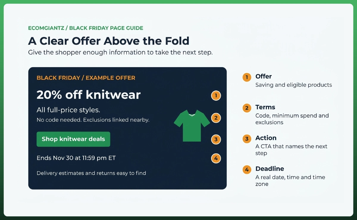
Your first screen should explain the deal before asking shoppers to explore. Include the eligible range, saving, main action, and essential conditions. A large campaign image can support that message, but it should leave enough room for readable offer copy and the button.
“20% off all full-price knitwear” answers more than “Our biggest event is here.” If the discount requires a code or minimum spend, say so nearby. “Up to 50% off” also needs context when only a small selection receives the maximum reduction.
Match the Message and CTA to the Campaign
Keep the advertised product, saving, and deadline consistent after the click. Your Black Friday email marketing should promise the same terms shoppers find on the page. If an email features a particular bundle, link directly to that bundle or its section.
Choose button text that explains what happens next. “Shop Knitwear Deals” can open a collection. “Choose Your Bundle” can lead to a selector. Repeat the primary action where helpful, while keeping unrelated subscriptions or promotions from competing with the purchase decision.
Use Real Deadlines and Availability Messages
Show the sale end date, time, and time zone. A countdown can help when it reflects that deadline, but the offer should remain understandable without one. Stock messages need current inventory data, including the availability of the specific variant being promoted.
Decide what happens when the timer ends or the product sells out. Update the page and pause affected campaigns together. An unavailable hero product needs a clear explanation and relevant alternatives, rather than an unchanged button that sends shoppers into a dead end.
Build the Page Around What Shoppers Need to Know
Show the Right Products First
Give priority to products that fit the campaign and are available to buy. Consider demand, stock, margin after discount, and likely delivery issues together. A bestseller with almost no available sizes may be a weaker lead product than a well-stocked alternative.
Arrange larger selections around shopping needs, such as gifts under a price limit, recipient, category, or use case. Keep the sorting useful. Visitors should be able to find a relevant deal without opening every product or scrolling through an unrelated catalog.
Make Product Information Easy to Scan
Show a clear product image, name, price, key benefit, and availability. Add genuine ratings when available. If prices vary by size or configuration, make the starting price and variation clear so the selected product does not feel unexpectedly more expensive.
Keep the copy easy to read. Unbounce’s 2024 report associated fifth-to-seventh-grade ecommerce copy with a 5.6% median conversion rate, compared with 1.5% for professional-level language. That association supports clarity; it does not prove a reading-level change will produce the same result.
Add Trust Signals Before Checkout
Use Relevant Reviews and Customer Proof
Answer the doubt that could block this purchase. For clothing, a review about fit and fabric may help more than a general compliment about the brand. For a gift set, customer photos can make the contents and presentation easier to judge.
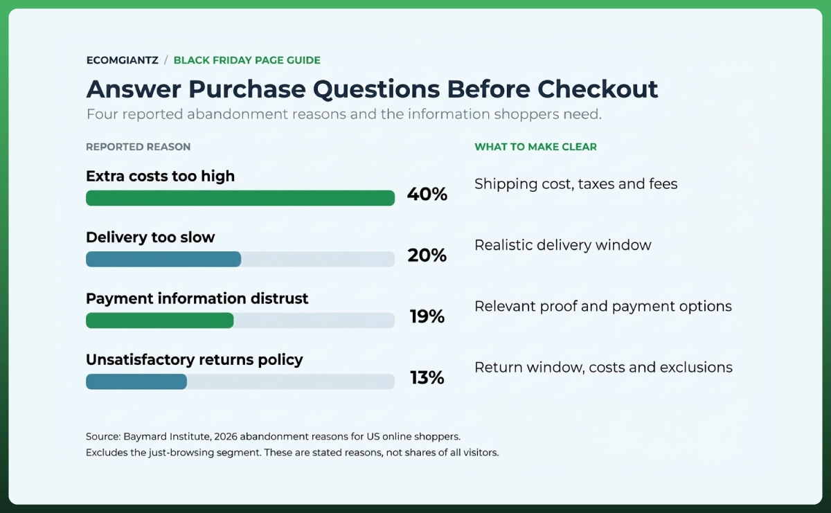
Baymard’s 2026 abandonment research lists payment-information distrust at 19% and an unsatisfactory returns policy at 13% among reported reasons. These are survey findings about abandonment, not predicted losses from your page. Use them to prioritize questions shoppers may bring to checkout.
Make Returns and Support Easy to Find
Explain whether sale items follow your usual return policy. Highlight final-sale exclusions, return costs, and any extended holiday window. Give shoppers an accessible route to support. Display accepted payment methods accurately, and only show certifications or guarantees that apply to the purchase.
Check every policy date when refreshing the page. During this review, Gymshark’s 2026 page still contained a returns window from the previous season. Even an established brand’s example needs scrutiny before you borrow its content or treat it as a complete model.
Make Delivery and Shipping Information Clear
Explain Shipping Costs and Delivery Expectations
Shipping belongs in the buying decision. In the same Baymard findings, high extra costs appear at 40% and slow delivery at 20%. State your shipping threshold, delivery estimate, and important restrictions early enough that shoppers can judge the complete offer.
Show the remaining spend for free shipping only if the calculation reflects the actual discounted cart. Specify whether the threshold applies before or after discounts. For international orders, explain where shoppers can check duties, taxes, and location-specific delivery options before payment.
Keep Peak-Season Promises Realistic
Separate dispatch time from delivery time. “Ships within two business days” describes processing, while “arrives within two business days” promises receipt. Use delivery estimates that account for your warehouse workload, shipping destination, carrier service, and relevant weekends or public holidays.
Update the message when capacity changes. If you cannot support a fixed arrival date, explain the expected window and where customers can check it. A clear, realistic estimate gives buyers a firmer basis for deciding than an appealing promise your team cannot keep.
Create a Simple Path From Landing Page to Checkout
Send Shoppers to the Right Product or Cart
Match the destination to what the shopper still needs to decide. A category CTA should open the relevant sale collection. A product requiring fit information may need a product page. A fully specified bundle can offer a direct add-to-cart option when the platform supports it.
For a practical Black Friday landing page design check, follow each route yourself. Can you select the intended variant, see the correct price, and confirm what entered the cart? Clear confirmations matter, especially when a shopper adds products without leaving the sale page.
Remove Friction and Handle Unavailable Products
Test discount codes, automatic discounts, bundle rules, and any stacking restrictions together. Make sure the cart explains the savings accurately. A promotion that looks correct on the landing page but fails at checkout needs attention before more visitors arrive.
Keep available alternatives visible when stock runs out, and remove unavailable items from featured positions promptly. Coordinate that update with the campaign owner. Otherwise, you can continue paying for visits to a product the customer has no reasonable way to buy.
Make Your Black Friday Landing Page Mobile-Friendly
Make the Offer Easy to Read and Act On
Adobe forecasts mobile will generate 57.4% of US holiday online spending in 2026. That is spending share, not traffic share. Check the entire mobile journey, including price readability, variant selection, forms, cart feedback, and any banners covering the page.
Test with cookie controls, sale banners, and signup pop-ups present. Each can reduce the space available for the offer. Keep close controls visible and check that sticky buttons do not cover product options, support links, or the next step in the purchase journey.
Improve Loading Speed and Visual Stability
Google’s current good thresholds are LCP within 2.5 seconds, INP at or below 200 milliseconds, and CLS at or below 0.1. Assess the 75th percentile of real page loads separately for mobile and desktop. A laboratory test helps diagnose problems but does not replace field data.
Use responsive images, reserve their display space, and remove unnecessary scripts. Avoid lazy-loading the main hero image when it delays the first screen. Prioritize a stable, usable page over heavy animation, and test on a slower phone as well as your usual device.
In one historical Rakuten 24 performance experiment, conversion rose 33.13%, and revenue per visitor rose 53.37%. Those results belong to that test. For your store, measure whether the performance changes improve the buying journey and commercial outcome.
Optimize the Landing Page for Black Friday Traffic
Publish Early and Maintain an Evergreen URL
Use a stable address such as /black-friday/ and refresh the content each season. Google recommends publishing event pages early, linking to them prominently, and reusing the URL. Check indexability before launch rather than assuming a newly published page will appear in search immediately.
Write a descriptive title and keep the offer, product names, prices, and conditions in readable page text. Use crawlable product links. Those details help shoppers and make the page easier for search systems to understand, without requiring visitors to decode a promotional image.
Update the Page Before and After the Sale
Before launch, explain what visitors can do now and what will happen next. During the event, maintain valid offers and available products. Afterward, replace expired promotion copy with an honest sale-ended message and useful routes to current products or future updates.
Keep the wider BFCM checklist for ecommerce separate from this page review. Inventory planning, fulfillment capacity, and campaign scheduling still matter, but the landing page should present the current buying conditions clearly. Give someone responsibility for updating those conditions throughout the event.
Test and Improve Your Black Friday Landing Page
Test the Complete Shopping Journey
Open the links from the actual campaign materials and place test orders across your main devices, payment routes, and delivery markets. Check eligible and excluded products, discount thresholds, unavailable variants, confirmation messages, and the sale-ending transition. Record failures with a clear owner before launch.
Verify tracking against real test behavior. Google Analytics ecommerce guidance covers item views, cart actions, checkout, and purchases. Confirm the relevant events, values, and currency arrive correctly, and check that reloading a confirmation page does not create a duplicate purchase.
Measure CTA Clicks and Commercial Results
For Black Friday landing page optimization, connect engagement with purchases. A higher button click rate helps you understand interest, but it can hide problems further along the journey. Review these measures for sessions that started on the campaign page, using consistent definitions.
Metric
Calculation
What It Helps You Check
Primary CTA click rate
Sessions with a primary CTA click ÷ landing-page sessions × 100
Whether visitors take the intended next step
Add-to-cart rate
Sessions with an add-to-cart action ÷ landing-page sessions × 100
Whether interest progresses toward purchase
Purchase conversion rate
Sessions with a purchase ÷ landing-page sessions × 100
Whether visitors complete an order
Revenue per session
Purchase revenue ÷ landing-page sessions
How much revenue the page’s traffic produces
Separate results by device and traffic source. Unbounce’s report gives a 4.2% median for ecommerce landing pages, but its platform benchmark is not a Black Friday purchase target. Your own comparable campaign data, offer economics, and conversion definition provide a more useful basis for decisions.
Here is a worked example, not a forecast. With 10,000 sessions and one order per purchasing session, moving from 2% to 2.5% conversion adds 50 orders. At an unchanged $60 average order value, revenue rises from $12,000 to $15,000 before costs.
Use A/B Testing When Traffic Supports It
Test a clear hypothesis, such as whether explaining the bundle’s contents reduces hesitation. Decide the main success measure and the improvement worth detecting before starting. Allow enough traffic and time; a few extra orders during one busy hour do not establish a reliable winner.
If the sample is too small, use customer questions, purchase-path checks, and observed usability problems to prioritize fixes. Monitor margin alongside revenue. A version that sells more through a deeper discount may still leave the business with less money after variable costs.
Black Friday Landing Page Best Practices Checklist
Use this final review before you increase campaign spend. These Black Friday landing page best practices should describe what a shopper can actually see and do, so open the page and verify each item instead of checking boxes from memory.
The offer explains the savings, eligible range, exclusions, and deadline.
Each campaign arrives at the promised product, bundle, or collection.
Main CTAs work, and required product choices are clear.
Featured products have current prices and available variants.
Reviews are genuine, relevant, and easy to assess.
Returns, shipping costs, and delivery expectations are accessible.
Mobile banners and pop-ups leave the buying controls usable.
Discounts work through cart, payment, and confirmation.
Events record correctly, without duplicate purchases.
Someone owns stockout updates and the sale-ended transition.
Frequently Asked Questions
What Should a Black Friday Landing Page Include?
Include a clear offer, eligible products, primary CTA, genuine reviews, shipping costs, delivery expectations, return terms, and a working route to purchase or sign up.
Should I Create a Separate Landing Page for Black Friday?
Create one when your promotion needs a distinct message or product selection. An existing collection can work if it presents the offer and buying details clearly.
What Is a Good Black Friday Landing Page Conversion Rate?
A useful target depends on traffic source, product, price, and conversion definition. Compare purchases and revenue with your own similar campaigns before applying broad industry benchmarks.
Does a Black Friday Landing Page Need a Countdown Timer?
No. A visible end date and time can explain the buying window. Use a countdown only when it accurately follows the offer’s real deadline.
Should I Keep My Black Friday Landing Page After the Sale?
Keep a useful recurring page and update it when the sale ends. Remove expired claims, explain the current status, and provide relevant shopping or signup options.
Final Thoughts
Review your page as someone deciding whether to spend money with you for the first time. Can they understand the savings, choose a suitable product, check delivery and returns, and complete the purchase? Fix the weakest part of that journey before increasing traffic.
Ecomgiantz can help you put the design, development, and purchase-path improvements into practice. Bring a clear offer and the products you want to promote, then build a sales experience your team can keep accurate throughout Black Friday and Cyber Monday.
Ready To Boost Your Black Friday Sales?
Create a High-Converting Black Friday Landing Page That Attracts Shoppers and Drives More Sales.
Ecomgiantz Team consists of our in-house experts who share their hands-on experience in ecommerce businesses, websites, marketplaces, etc. We also share the latest updates, insights, and market trends that can be helpful for your online business.